transform ul list into stylish navigation bar with flex layout
ul list navigation without style
<!DOCTYPE html>
<html>
<head>
    <meta charset="UTF-8">
    <title>A Stylish Site</title>
    <style>
        /* add css here  */
    </style>
</head>
<body>
    <nav>
        <ul>
            <li><a href="#">Home</a></li>
        </ul>
        <ul>
            <li><a href="#">People</a></li>
            <li><a href="#">What We Do</a></li>
            <li><a href="#">Join Us</a></li>
            <li><a href="#">Contact</a></li>
        </ul>
    </nav>
</body>
</html>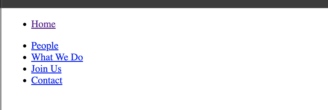
to style the ul list, follow the steps below:
- set or remove default styles
- set any elememt to have margin:0 padding:0 box-sizing:border-box
- body font-family
- ul list-type to none
- link test-decoration to none
- link text color
- link:hover text color
- link font-size
- link font-weight
- styling parent container nav
- background-color
- margin padding
- box-shadow
- use flex justify-content gap to lay elements horizontally with gap in between
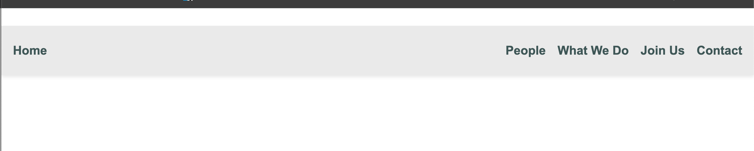
the completed css styles:
* {
    margin: 0px;
    padding: 0px;
    box-sizing: border-box;
}
body {
    font-family: Arial, sans-serif;
}
nav {
    display: flex;
    justify-content: space-between;

    background-color: #eaeaea;
    padding: 30px 20px;
    margin-top: 30px;
    box-shadow: #00000017 0px 3px 6px;
}
ul {
    list-style-type: none;

    display: flex;
    gap: 20px;
}
ul>li>a {
    text-decoration: none;
    color: #565656;
    font-size: 1.3rem;
    font-weight: 800;
}
ul>li>a:hover {
    color: #48b984;
}
Summary:
<nav> display:flex will let two children <ul> lay out horizontally, as the default for flex-direction is row. <nav> justify-content:space-between will arrange the extra space in between two <ul>, so that HOME link goes left and the rest links go right.
In the same way, <ul> display:flex will let <li>s lay out in row by default and <ul> gap:20px will give 20px gap among children <li>s.